Branding Guidelines
A web summary of core DataRemote brand standards for messaging, logo usage, color, and typography. This page is designed for quick internal reference and partner alignment.
Our Brand
Core brand expression and positioning foundation.
DataRemote is a recognizable expression of technology in motion, connectivity, and communication. Brand principles deliver the essence of who DataRemote is, what it does, and why it does it, and they serve as the foundation for messaging and a unifying force across communications.
Teams and partners should use these principles to shape and inform communications with clarity and consistency.
Our Principles
Shared vision and brand personality statements used to align internal and external expression.
How we pursue our vision
We unleash innovative, enterprise solutions to move data-over-wireless.
What we stand for
End-to-end rapid-time-to-market and cost-effective business solutions.
The benefit our audience gets
Enterprise solutions designed to scale with you and the evolution of technology.
The impression we leave
Experts at remote data acquisition.
Brand Messaging
Short-form messaging statements that can be used directly or adapted into copy.
Who we are
We are an enterprise technology company specialized in traditional phone-line replacement, wireless M2M data connectivity, wireless perimeter security, and fleet tracking solutions.
What we do
We deliver data-over-wireless and business solutions to keep operational processes and users connected.
How we do it
Our comprehensive engineering, cutting-edge hardware solutions, and top-tier service deliverrapid-time-to-market and cost-effective business solutions.
Why we do it
We want to enable enterprises to transmit signals from connected analog devices over highly secure digital data network connections.
Tagline
Approved verbal expression of the brand.
Moving Data Over Wireless
The tagline may be used as a standalone element or with the approved logo + tagline lockup. Preserve the wording and meaning exactly.
Logotype & Color Options
Approved logo usage guidance and downloadable placeholder assets.
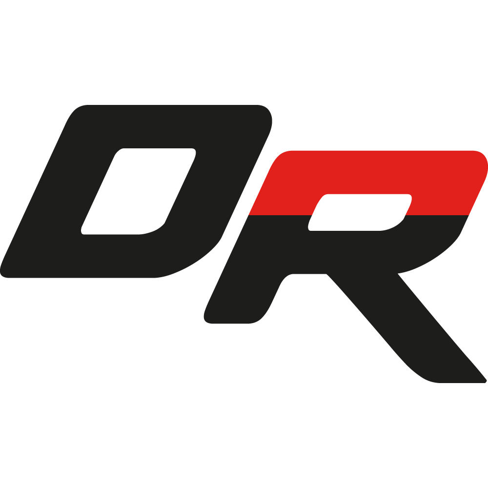
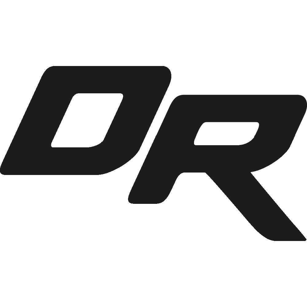
The DataRemote logotype is a custom-designed typographic representation of the company and functions as the official brand signature. Use approved artwork files and stage the mark for legibility and impact.
Preferred usage is the original 2-color reproduction. Alternative approved options include one-color and reversed versions depending on background and contrast requirements.
Monogram
Compact brand mark variations with downloadable placeholder assets.
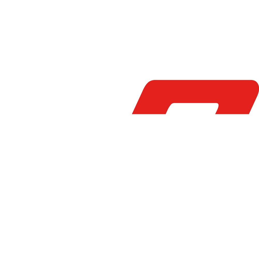
The monogram is a fragment derived from the custom logotype and may be used as a symbolic representation of the company when the full logo is not practical.
As with the full logotype, the original 2-color monogram is preferred, with approved alternate color options used based on background and contrast.
Color Palette
Primary and supporting colors for brand consistency across digital and print.
The core palette centers on DataRemote Red and Black, with White and Gray used as supporting colors for text, graphics, and backgrounds.
#e1251b#1d1d1b#ffffff#9d9d9c| Color | Recommended Usage | Notes |
|---|---|---|
| DataRemote Red | Buttons, accents, highlights, active states, dividers | Use sparingly for emphasis and brand recognition |
| Black | Primary text, logo, headings, anchor visuals | Default dark brand tone |
| Gray | Secondary text, UI lines, muted labels, diagrams | Support color; avoid low-contrast body text |
| White | Backgrounds, reversed layouts, breathing space | Use to maintain clarity and clean spacing |
Typography
Open Sans family usage shown in the brand guide.
The brand guide specifies Open Sans as the primary type system, with Regular and Bold as primary weights and Light as a secondary supporting weight.